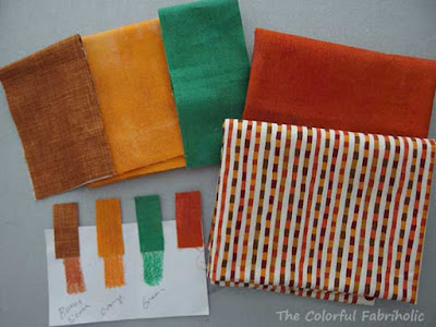
I drew Burnt Sienna, Orange, and Green. Yuck, what am I going to do with these? The orange and green aren't so bad, at least they're both similarly bright. But the Burnt Sienna just doesn't harmonize with them because it's way more toned down.
First step, find matching fabrics:
I had ordered the orange Grunge for another project but ended up not using it, and it's a pretty good match. The green was tough; most of the popular greens now are either yellow-cast or teal-cast. I had this green Grunge left over from PAussitivity and it's the closest I could find to the crayon. The Burnt Sienna was hard to match. I finally bought a FQ of this one, but there's no source info on the selvage.
I was so not inspired. I had no clue what I was going to do with these. Then in September I got an ad in the mail with a maple leaf log cabin quilt pictured in it. Hmm... Fall colors, maybe maple leaf blocks? Maybe a table runner?
The inspiration photo had way too many colors in it, covering the whole spectrum. Could I make something work with just my three? I looked for other fabrics in my stash that could work, and found a stripe that had both the Burnt Sienna and the Orange in it, as well as a darker red orange. I thought I could use the stripe for binding to help tie the colors together, and add the red orange to my palette. (Adding red-orange makes the original orange read more gold, doesn't it?! Colors are so relative!)
So at Sew Me St Louis (STLMQG retreat) I make maple leaf blocks in each of my four colors. I framed them up with contrasting colors like the inspiration photo. When I got home I sewed the blocks together.
Not working. Not even some fancy quilting could rescue it. I didn't even take any photos, it was so ugly. So I took the blocks apart, reduced the width of the frames around them, and added print sashing between them. Still not a very pretty table runner, but it's the best I can manage. Here's the top, and I just have to quilt it and get it bound and labeled by Nov. 12.
I'm not loving it, but at least I'm participating and making something with these unharmonious colors. I hope I don't get disqualified for using the print.
Linking up with Sew Fresh Quilts


Excellent solution! It's really not so bad - just not YOU. At least you participated and you can always gift it to someone else.
ReplyDeleteI agree with Libby, I don't think it's bad and that it's just not your style or taste. I definitely saw fall as an inspiration when you shared the original three colors, and getting them in the middle of summer was probably hard timing! I will be interested to hear how the showing goes and I hope the print is allowed - it uses all the colors you have!
ReplyDeleteLooks like a fall color pallet to me? And, what a nice table runner to use in the fall! Having experienced the modern guild, I am unsure if they will find it "modern" enough, as only a select few in that guild can make anything truly modern (their thoughts, not mine) but, I certainly applaud your efforts.
ReplyDeleteOh my!!! What you did with it is amazing!! I think it makes a great autumn table runner - and kudos for working with colors you did not like - that always makes me put things away.... ( yes - I am a great procrastinator!)
ReplyDeleteAutumn was the first thing I thought of when I saw your palette. I think you did a wonderful job with it--especially with those two-color frames. And how neat is it that you had that print with the same colors. I don't know about you, but I kind of like projects that take me out of my comfort zone or style--and they can always be gifted to someone who admires them.
ReplyDeleteFunny because I thought ah, burnt sienna and orange are good together and saw the green as the odd man out. I'm with the other commenters, it's a fine table runner, just not you ;-)
ReplyDeleteYou did a great job with the color palette. Making leaves was the perfect idea. You ended up with a very fun table runner.
ReplyDelete